-
- Open the new worksheet in Tableau.
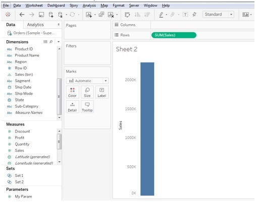
- Drag the sales into the rows shelf.
-
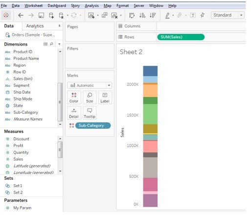
- Drag the sub-categories into the colours pane.
-
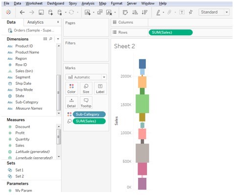
- Drag the sales into the size pane.
-
- Sort the sales in ascending order where all the sales will appear on one pane with ascending order and it appears like a funnel shaped chart.
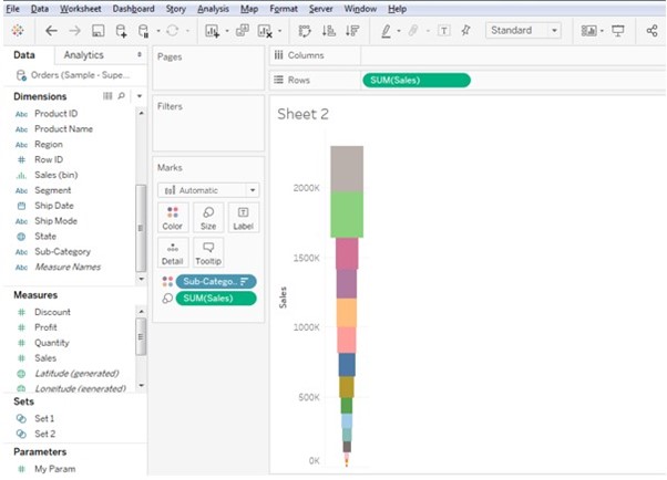
-
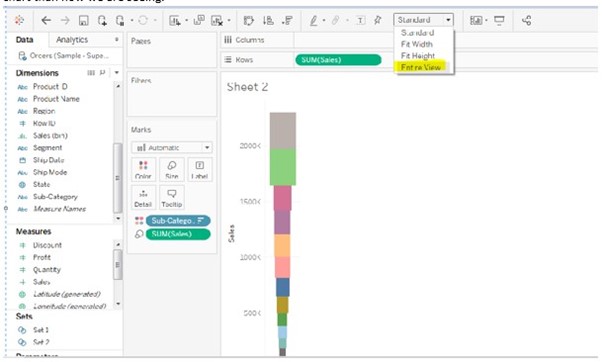
- Still the chart is looking like funnel shape we can adjust the chart to entire view to get better shaped chart than now we are seeing.
-
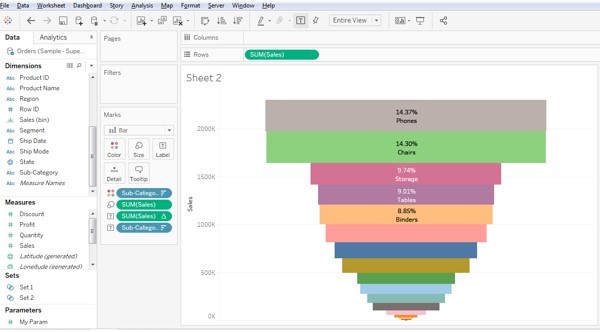
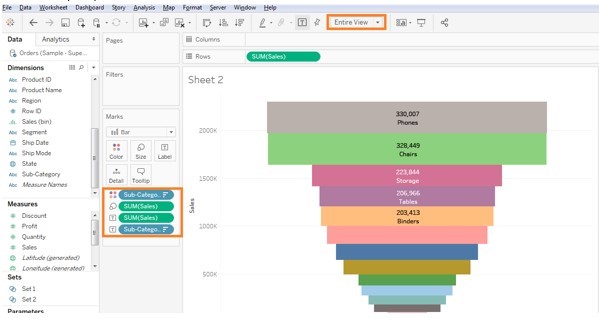
- Also place the subcategories into the colour’s marks card and Labels mark card and sales into the labels mark pane, it reflects as shown in the below screenshot.
-
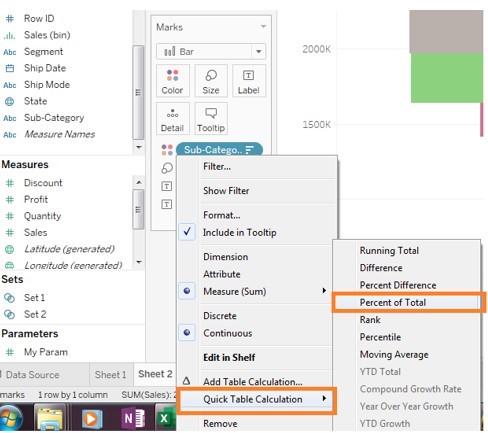
- As we need to display the percent of total sales in the funnel chart, select the Sum of sales in the label marks card and select quick table calculation and select the total of percent.
-
- After selecting the Quick table calculations then we will get the below funnel chart with percent of total sales in tableau.
